


Creating healthcare environments that promote the safety of patients and staff while facilitating treatment is a universally accepted priority of modern design. Every detail from a facility’s lighting to its colour palette can directly influence the quality and effectiveness of care. One area where cohesive design is becoming increasingly important is residential healthcare, which encompasses not only senior living but also rehabilitation, behavioural health, memory care and mental health.
These communities, although healthcare environments, are residential in nature, and the people who live there must feel safe and secure. The built environment can support this as long as there is an understanding of the underlying human need and appropriate finishes are selected that promote wellness, support independence, and foster safety and security.
The human need in residential healthcare is influenced by a variety of factors but one of the most significant is North America’s rapidly growing 65-plus population. With aging comes a natural decline in eyesight, hearing and motor skills, which impairs the ability to perceive surroundings. In addition to natural aging, there are a growing number of residents with cognitive impairment, chronic illness, behavioural issues and mental illness, not to mention medication, sleep deprivation and a host of other elements that can create disorientation. These factors result in an environment that is more difficult to understand and navigate, making everyday tasks stressful and frustrating. In response, healthcare design has shifted focus from traditional sterile-looking aesthetics toward creating calm, welcoming residential environments.
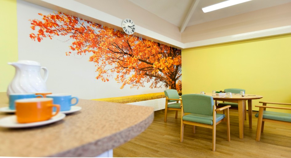
One of the key objectives in residential healthcare is to promote wellness. This is more than having a healthy physical body. It also includes social, spiritual, emotional and intellectual well-being. There is an increasing trend toward the use of brighter, more saturated and optimistic colour palettes compared to traditional neutral options, as it is easier for the aging eye to perceive and appreciate the effects colour has on emotion. Colour, selected to enhance the purpose of an area, has been shown to alter psychology and physiology, enhancing the wellness of residents. For example, green may be used in a resident room to contribute to calmness and rest, while yellow may be employed in the kitchen and living areas to infuse energy and optimism.
Biophilic design, the strategy of implementing nature into the environment, can also create a sense of serenity and well-being in these spaces. Evidence-based design studies support the concept of using realistic and natural art as a means of providing a positive distraction, which can have a therapeutic effect as well as reduce anxiety and agitation. Experience has shown that closeup imagery of natural pictures is better in these environments than scenic landscapes.
Understanding that residents engage all of their senses to sort through disorientation and navigate their environments, acoustical properties need to be considered in material selection. Materials with sound-reducing qualities that contribute to more peaceful spaces help create a built environment that fosters relaxation and connection. For example, when residents can sit in a quiet dining area and engage in conversation, it creates connection and combats the perception of being isolated.
While colour palettes and acoustics are key components of residential healthcare design, other design elements can contribute not only to wellness but also to a resident’s ability to remain independent. The Facilities Guidelines Institute’s (FGI) Guidelines for Design and Construction of Residential Health, Care and Support Facilities touches on a number of these elements in selecting flooring and wall protection materials. To prevent visual misperception, FGI recommends non-glare finishes with small, low-contrast patterns. Try to avoid medium-size patterns approximately one-inch by six-inch, as these have been associated with an increased incident of falls. Visual perception is a complex process with one very important component being how edges and boundaries are perceived, so this needs to be considered when designing elements that contribute to orientation and wayfinding. Contrasting colours may create visual changes that help distinguish one space from another but the amount of light reflected from surfaces plays a major role in keeping residents safe and secure.
The best way to measure contrast between surfaces is to understand the light reflectance value (LRV) of the material being used. Every material has a LRV marked on a scale of 1-100, with one absorbing light (black) and 100 reflecting it (white). To meet requirements set by FGI, different categories of adjacent flooring that are level and even call for similar LRVs (10-point variance or less) must be used to avoid the illusion of a nonexistent step. Conversely, FGI states there should be at least a 30-point variance in LRVs between adjacent surfaces like floors and walls. If the difference between floors and walls, floors and furniture and steps is too subtle, it can result in potential injuries. However, when properly combined, sufficient colour contrast and LRVs allow residents to navigate their environment with confidence, supporting their independence.
Residential healthcare design must not only take into consideration environments that promote wellness and independence but also foster safety and security. Many factors can influence a resident’s sense of security but the most prevalent in the built environment is preventing injury due to slips/falls, trips/falls or self-harm. FGI recommends slip-resistant surfaces on ramps/entries, in bathing areas and in kitchens. The appropriate choice of flooring to prevent slips/falls depends on a number of factors, such as demographics (residents, care providers or support staff), surface contamination (water or grease) and pressures on the finishes (wheel chairs, heat and moisture).
Transitions between different flooring materials as well as between floors and wall protection, if not done properly, can have a high potential for injury and accordingly require special attention. Although accessibility standards allow varying floor heights, this has been found to be potentially detrimental to these fragile populations, so FGI recommends transitions between adjacent materials be level and even. Proper detailing is necessary to ensure residents can safely navigate without tripping on flooring or scraping their hands on walls and corner guards. In order to reduce the risk of injury due to fall incidents, user fatigue or musculoskeletal injury, FGI recommends reviewing softer materials with insulated backings that ‘give.’ This, of course, must be balanced with the need for durable materials that remain intact and functional in heavy weight-bearing, high-traffic and impact-susceptible areas. Examining the activities occurring in a space and the underlying human need is key to appropriate material recommendation and a safe and secure community design.
Understanding the increasing fragility of people in residential healthcare and selecting the appropriate finishes to not only promote wellness and support independence but also foster safety and security is key to creating households, neighbourhoods and communities that encourage connection and inclusivity. Residential healthcare design, when done well, can provide homes to residents regardless of level of fragility or disability that are safe and secure and contribute to that sense of belonging that is central to health and well-being.
Susan Drew is the market segment manager, senior living and residential care, for Altro Americas. With more than 15 years’ experience in the flooring/walling industry and a marketing background, Susan brings a wealth of knowledge to the unique challenges of the residential healthcare/senior living care environment.