


In the wake of the surging popularity of neutral tones, simply using a bold colour to stand out misses the point. Effective use of colour needs to be deliberate, methodical and, at times, subtle. It must always be motivated by a clear design rationale that can be related aesthetically to the built form, functionally to wayfinding or branding, or psychologically to the needs of the end user. Often, designing with colour draws on a combination of all of these factors.
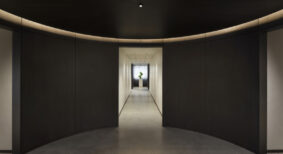
Colour can enhance form. A colour-neutral interior may be effective for creating a light or tranquil space but may also render that space static by suppressing the dynamic and stimulating aspects of the architectural form. By drawing attention to features – a bump-out in a wall or along a ceiling, relief along windows, the flow of space through rooms and corridors – carefully planned colours can amplify the architectural character of a space.
In a retail environment, colour can be effective in drawing customer focus and attention to merchandise. It can also push roadside visibility and recognition.
In institutional environments like a seniors facility, colour can play a fundamental role that is at once functional and psychological. As a wayfinding device, colour can be used to highlight different floors and branches – for instance, in designs where administrative, kitchen and dining facilities form a central axis with residential wings branching off. Colour-coded elements can help visitors and residents identify the various ‘neighborhoods’ within a building, avoiding the confusion potentially created by a monochromatic colour scheme.
Colour can have psychological and emotional impact that is related to the use of a space. For instance, a colour selection for a long-term care wing in which patients may suffer from dementia will not be the same as that used for a social room in an independent living wing. Muted and low contrast colours better suit the former use, while brighter and more stimulating colours may serve best in a social or dining area.
A colour-centric approach has potential drawbacks. Rich colours can drive up costs through things like quantity of paint and time required for multiple coats and maintenance headaches. Colour fads also come and go – a chic choice may appear dated eight years down the road, leading to new interior costs.
It’s important to be practical with colour; however, what practical means will differ from one job to the next. In residential applications, a cost effective way of staying current without fear of future renovations is to use neutral building materials – in countertops, tile flooring and so on – while adding colour through paint, fabrics, accessories and art. At the other end of the spectrum, health facilities need to update materials as part of regular maintenance. It can be more effective to introduce colours through building materials like carpet, tile, stone and wood in order to lower costs on expensive paint upgrades. For corporate clients, a carefully branded environment runs no real risk of becoming a passing fad as long as the client is consistent in their own corporate identity.
Susan Kaspar is director of interior design with Calgary-based Abugov-Kaspar, a fully integrated design firm encompassing all aspects of architecture, urban planning and interior design.